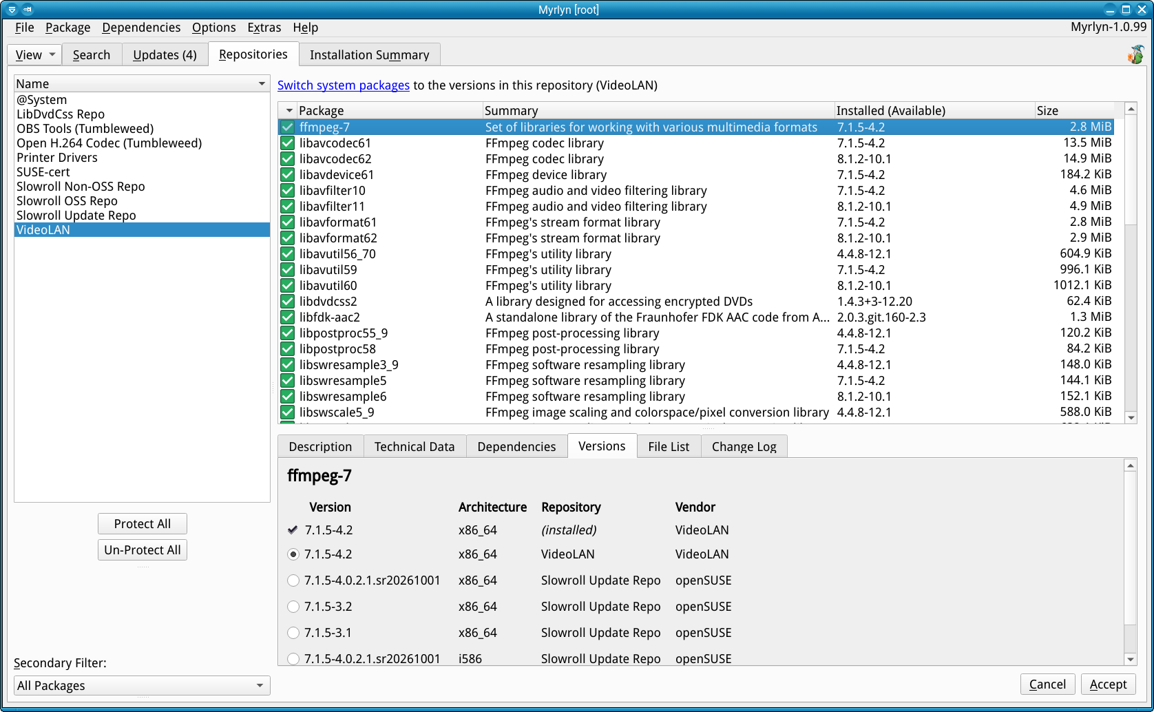
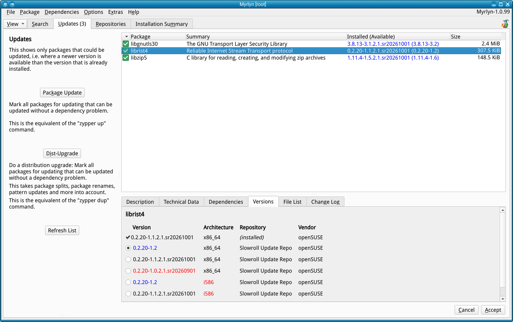
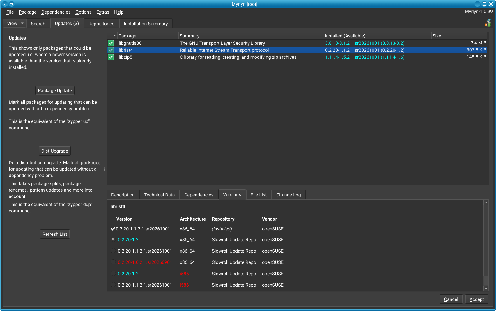
I think using various colors provides an instant “blue means xxx”, “red means yyy”, and so on. If no colors, folks are left to figure out if there is “anything I should be aware of” in the list.
( “a picture is worth a thousand words” )
That’s a bit curious to me. If my architecture is known to be x86_64, why would an i586 package be included in the list?
Because the repos provide them. That table is the “pick list” of all Zypp “pool items” from all active repos. I’d avoid i586 architecture packages because they only drag in a ton of other i586 packages, but I read that you need an i586 runtime for e.g. Steam.
Hm, yes and no. Right and wrong.
Steam requires 32bit support. As example video drivers. But technically these packages are provided for x86_64. The 32bit nature is defined by the package name. See as example
nvidia-video-G07-32bit-595.104.02-11.1.x86_64.rpm
Also have a look at the mirror structure of e.g. Tumbleweed. There is only the x86_64 and noarch directory. There is no i586 or i686 directory since a long time as they are seperate ports since a long time.
I wouldn’t mark 32bit packages/libraries red which are correctly shipped as x86_64 (see graphic driver example above) as they are absolutely needed for several applications. But red means danger/wrong/alarm.
Red would only make sense (as it is alredeady implemented) for a package which will automatically get removed or downgraded.
I like it; one consideration for the use of color is accessibility. Having color-based indicators is useful for those who can see it, but there needs to be something additional to call out the differences for those who cannot perceive those color differences.
Right, I’m just suggesting that an additional hint (such as an icon of some sort) for those who have vision impairments would also be useful.
The purpose of color as a visual cue is to improve speed of processing for the user. Having a similar functionality for someone who has a visual limitation gives them the same advantage - quicker ability to spot the differences at a glance.
Principles around accessibility by design are not to do with being compliant with accessibility needs. It’s about providing a good experience regardless of (in this case) one’s ability to perceive those differences quickly.
Nice to have, if you have normal vision.
If you are color-blind there is a chance that depending on the brightness of blue and red text it might just appear grey-on-grey in f.e. the “Versions” tab in Figure 2 above.
I think that missing the color cue might be acceptable, but just not seeing the actual text because it appears grey-on-grey is definitely not acceptable.
Maybe there are guidelines for app designers somewhere, but I never had to find out, sorry.
That would probably work for users with color vision problems, but I don’t know what that would render like for someone who was using a braille display or text-to-speech.
WCAG 2.2 is a good reference to work from, and you raise very good points regarding color contrast as well. Especially dark mode color coding, which can be a real challenge.
I’ve spent the better part of a year trying to learn more about this as part of a document accessibility project I took on.
The best guidance I ever heard, though, was from a UX designer who talked about “accessible by design” principles. The idea is that accessibility should never be a bolt-on after the design is done, it should be baked in from the start.
Neither the mountain of i586 packages (which not only the Slowroll update repo has, but also the Tumbleweed update repo) is not the topic.
Optimizing (optimizing, not making using it impossible for them!) for color blind users is not the topic. Has anybody ever considered this during the life time of the YaST Qt package manager? The versions have been color coded in the packages list there for well over two decades.
For those same decades, the versions tab has been a mess with content that was always hard to understand - just look at the YaST Qt package manager or Myrlyn in the version that almost all of you are probably using.
The first improvement was the table to make that content much easier to grasp. That includes moving the architecture to a separate column and line the repos and the vendors up in columns.
Then the next natural move was to do the very same thing that has always happened in the package list’s version column: Use color to give an additional hint. Previously, everybody had to read the version numbers carefully - those version numbers that have become absolutely insane over the years, with the Slowroll date in most of them; or with a Git timestamp and the Git SHA appended. It’s not enough to just have the good old “major.minor.patchlevel-buildno” scheme anymore. Why are we tolerating this insanity?
And with this background, we wipe everything else that really matters aside for the ever-important bikeshed discussion.
I don’t think making the UI accessible is off-topic, especially since the time to do it is now rather than as an afterthought. Good UX design is about usability, is it not? So how about we correct a mistake from the past where our UX wasn’t accessible and build it in from the start?
“Because we’ve always done it this way” is never a great rationale for not addressing an issue like this. Color-coded selections is absolutely a good idea, but why not take the extra step of making it accessible as well rather than needing to revisit it later when accessibility becomes an issue?
I don’t consider this bikeshedding, nor do I think that it’s appropriate to disregard the needs of people with accessibility needs especially at the start of a design phase where changes can be easily made to build accessibility in from the start.
This feedback is legitimate feedback regarding the use of a color scheme in a UI, because it directly applies to how people can use the interface. How is it not on-topic, when the entire point of the discussion is usability?
Or is it just OK to disregard the usability for segment of our users?
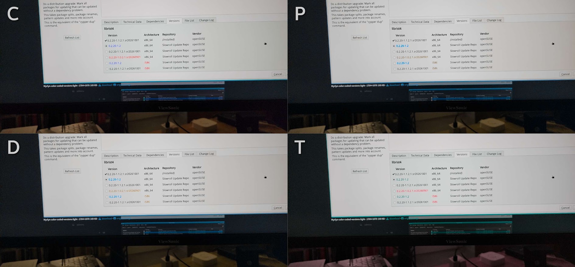
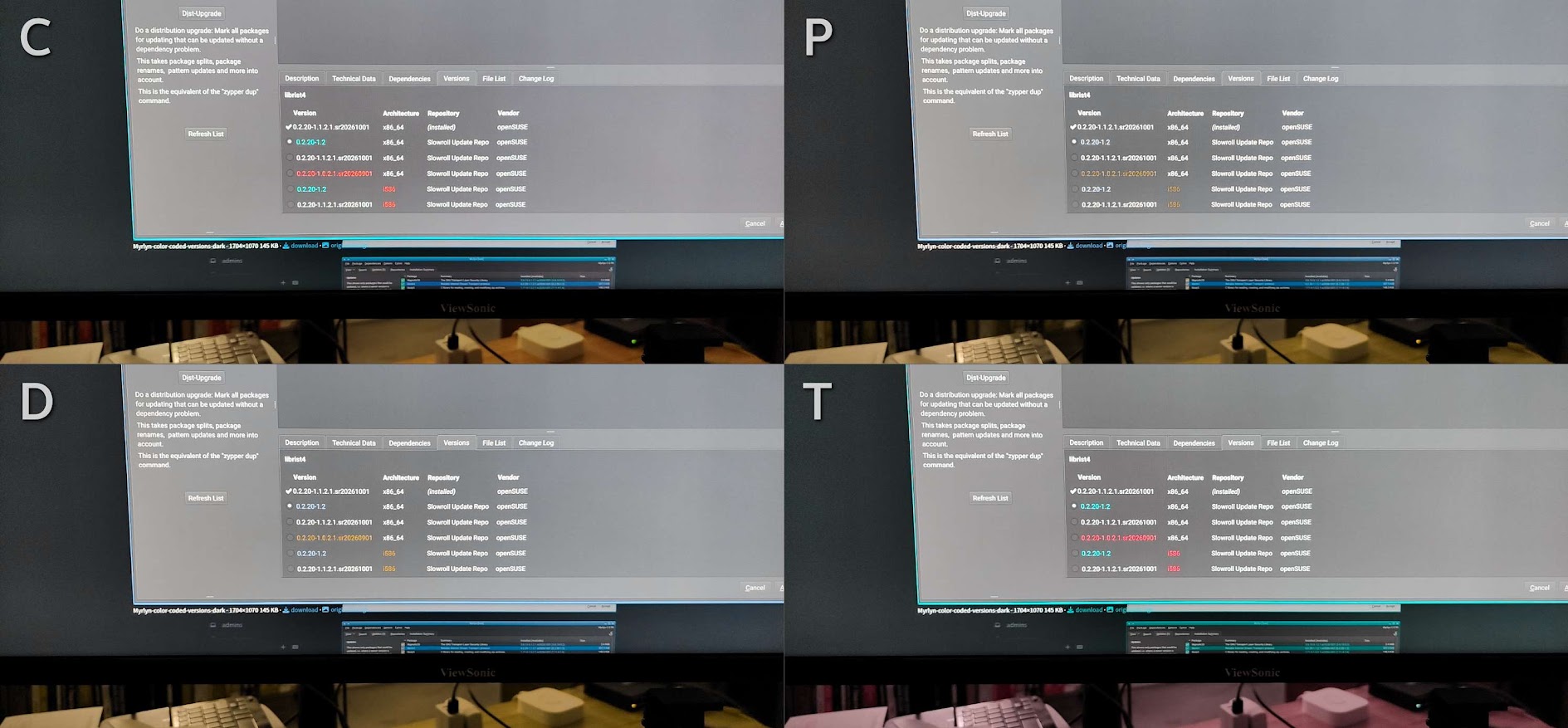
Here is an example of what the pages look like to those with different forms of color blindness (this doesn’t cover all possibilities or degrees, but provides some rough guidance):
C = Common (Normal Color Vision)
P = Protanope (Red-Weak or Blind)
D = Deuteranope (Green-Weak or Blind)
T = Tritanope (Blue-Weak or Blind)
Note that the weak versions are what is shown, the blind versions would be more servere, and this also doesn’t account for color contrast issues that would make it difficult for a visually-impaired user to see colors that contrast poorly with each other (for example, the red text on a dark background for someone with Protanope color blindness). My understanding is that if someone had complete red blindness, that brown color would be very difficult to see.
Now combine that with other vision issues (not uncommon in my understanding), and you can see why this is something that’s important to address.
The color contrast of the red with normal vision or Triatanope color blindness also is likely a problem, and contrast issues present a significant hurdle for people who have vision issues.
These images were taken using an Android camera app called CV Simulator.
All I’m suggesting here is two things: 1) Consider accessibility in the UX design, and 2) Ensure that users with accessibility needs are part of the thought process rather than being an afterthought when implementing changes that directly affect their ability to efficiently use the UX.
Bright style is OK (tabular format is an improvement)
Dark style is OK (correctly switches the default text to white for contrast)
Color is a nice to have, if you can appreciate it, so
making color optional in the preferences would be nice, or as an alternative
choose a tone of red (or another color altogether if there is one) that allows reading even to some color-blind users (the “do not pick this one” clue is more important than the “blue” one).
Stefan, this is hard to have a good opinion on that leads to mutual agreement. Color-weakeness / -blindness (me weak on Red/Green ) is not all. I remember “When alle Menschen statt Augen grüne Gläsern hätten würden die alles grün sehen”. We all perceive colors / contrasts different.
That said, I do see that using colors / contrasts can be helpful/useful. But you’ll never make everyone happy, so just do what you think is best.
I like the colors! I am a pretty visual person, so I always appreciate well thought out color hints.
I agree that accessibility is important and maybe as more colors are introduced, a ‘color blind mode’ option would be nice (perhaps replacing colors with icons), but as long as the colors aren’t a requirement for understanding the information, it’s not a strict accessibility issue. Adding customization increases complexity, so you do what you think is best for the project.
And thank you. I appreciate that you are taking the time to ask for community input. It isn’t easy to invite critique.