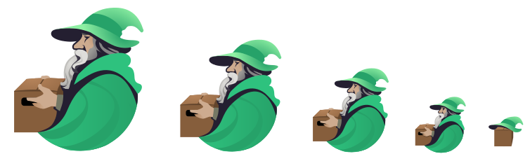
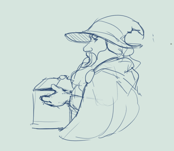
Although there are points brought up there, nobody has brought up yet that it doesn’t fit in with GNOME design at all, nor KDE for that matter. Furthermore it looks like AI and I dislike AI art with a passion. Inkscape isn’t easy yes, I’m trying to learn it at the moment. I’m an aspiring 2D/3D game artist who wants to learn how to make better SVG art, so I took this as an opportunity to practice. I used the “GNOME HIG Colors” color palette in Inkscape, this way I made sure at least the colors fit with GNOME if nothing else.
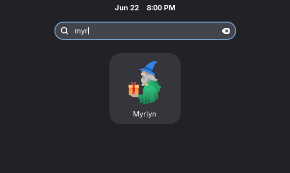
Here is the artwork:
Published under CC-BY-SA-4.0 or GNU GPL-2.0+ (at recipient’s choice). License inspired by https://wiki.debian.org/DebianArt/Themes/Ceratopsian
Feel free to tweak, fork, modify, redistribute
Discourse doesn’t allow SVG but I have it ready to upload somewhere, let me know if you have a particular need for it and we’ll find a way
The new icon is just a blur of color when viewed on displays and desktop environments with a decent resolution. Since it lacks any details or contours, it looks unattractive and as every other random icon.
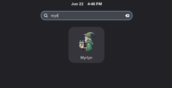
Icon design is a subtle art. The original design is good when viewed in large formats, for instance it looks great in the Myrlyn splash screen or with 4K screens, not that much as a menu item on smaller/older laptops.
The OP redesign IMHO is a bit too much on the way to simplification, maybe some reworking along the lines that @conram is showing might lead to the best “one size fits all” compromise.
Done! I made an issue specifically about the resolution of the current icon being to small. I could also open an issue about the icon style but I’m not entirely sure if most people will agree with me.
Although:
This seems like nice idea. I did see conram’s version before, and I was actually inspired by it since the shapes are really nice. Maybe that + more GNOME-ish colors could be really nice.
I did end up making that issue in the end: https://github.com/shundhammer/myrlyn/issues/138
I think it’s better to voice my opinion than not because I’m afraid that people will disagree. That’s certainly not what anyone wishes on anyone. Unless the opinion is diabolical but at that point I do no stand I’m sure
I have no formal education in graphic design. I just learned inkscape and blender looking at tuts on the net. If someone is interested in improving my icon feel free to do it like what @Arthurium did. I am doing this things just for fun and as a retiree to kill the time when I’m bored.
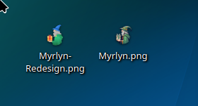
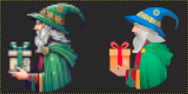
(enlarged to show the difference, actual icons are 80x80 pixels or so).
While the proposal may still be improved, I wouldn’t call the original “far superior” as a menu item.
And please remember that there are still many 1366x768 and even 1024x768 laptops in linux active service.
Hi, The light blue looks out of place with the man’s attire.
I think correct me if I’m wrong. The color green follows the openSUSE color scheme and myrlyn as the replacement of yast2 software management is unique to openSUSE.
Yep. Instead of the previous ribbon on top of the box, replace it with a lock that was on the side of the box before Not sure enough if it was a lock or a tag.
Just in case somebody with more experience with Inkscape wants to improve on my hints, a tweaked .svg can be downloaded from https://paste.opensuse.org/pastes/644968cd164e for a week.
I made just some tweaks based on the templates by @conram and @Arthurium , so I’m not claiming any rights to myself; I just hope that somebody might find that useful.
I do prefer yours over the original @Arthurium, blends in much better!
So much so that I felt inspired to give it a shot as well (and spend too much time on it)! Obviously I’m straying further from the gnome guidelines (simple shapes, no mascots and all that…), but better to keep it more fun imo. Sticking to the gnome palette and making it readable at smaller sizes is hard enough!
I could probably do an even less gnomey version with better readability if there’s interest (same with uploading a zip with these)
Thankyou! And likewise your version is looks nice as well. It has an interesting round dynamic to it, reminds me of Firefox’s curvature a bit with the cape. You also took in account that smaller versions should probably be more contrast-heavy, which is great.
I feel you with the spending too much time even though the initial intention was to “just give it a shot”. Very relatable!
That’s a pretty cool version! I like how this one feels more dynamic compared to how relatively static the wizard is in the original (just, standing there).


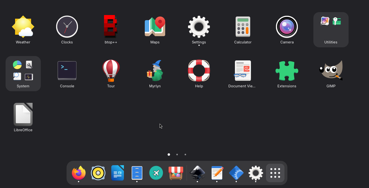


 )
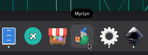
)