Font Rendering in Menus, Linux vs Windows

This isn’t really intended as a formal support request, but more a matter of trying to figure something out. Hopefully, I’m not the only one who has experienced this (otherwise this will be a very short-lived discussion thread) and if any answers can be found, then that would be great, too.

Let me add some screenshots so I can make it abundantly clear to everyone what specifically I’m talking about:

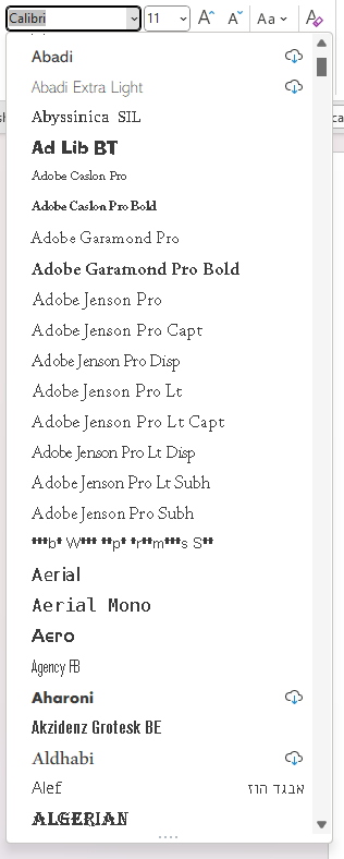
The font menu from Microsoft Word 365 in Windows 11:

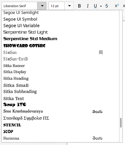
The font menu from LibreOffice Writer in Linux Mint 21.1:

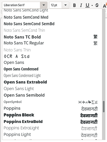
The font menu from LibreOffice Writer in openSUSE Leap 15.4/Gnome 3:

As you can see, most of the fonts in Word’s font menu are rendered as bitmaps or pseudo-bitmaps, with fonts that you can optionally download rendered from outline data. Conversely, those same font files are rendered from outline data universally in LibreOffice in both openSUSE and Linux Mint. However, before we proceed any further and you try to formulate a theory, I need to explain exactly what data is being used here on the back end.

A few years ago when I was working at another job that necessitated I regularly trade back and forth in MS Office documents with co-workers and higher-ups, I noticed that some of the fonts I’d pulled over from my Windows installation didn’t render correctly within the documents I was using. I was kind of bummed about that and sought about finding the root cause. Eventually I discovered what was going on, which I will explain in sufficient detail in the next two paragraphs. Suffice it to say, I resolved the issue.

There are essentially two kinds of TrueType files: the standard TrueType File, or “xyz.ttf”, and the TrueType Collection file, or “xyz.ttc”. If there is anyone here who, like me, has in-depth experience with Classic Mac OS (i.e. Mac OS 1.0 → 9.2.2), you will remember the olden days when we used these font “suitcase” files which contained strictly bitmap data for each typeface. That is, Times Roman, or Times Italic, or Times Bold, or Times Bold Italic. One would typically find bitmaps ranging from 7 or 8 point up through 24 point. PostScript (either Type 1 or Type 3) would be contained separately in individual PostScript outline files. Well, “.ttc” files are kind of like Classic Mac OS font suitcases, except that in addition to bitmap data, they can contain outline data. .ttc files are capable of containing just bitmap data, just outline (.ttf) data, or both. If you use a utility like FontForge to explore various Microsoft-generated .ttc files, you will find that some but not all contain both bitmap and outline data. You’ll also find that most of the Microsoft-supplied TrueType fonts are in .ttf files, and just a few are in .ttc to begin with.

Frankly, I have absolutely no idea why Microsoft did this, nor do I have any idea why they continue to ship the same files, other than laziness and a lack of the perception to do anything about it. Anyhow…

I have not conducted an exhaustive test of all or even most desktop environments, but what I have determined is that both KDE and Gnome (and therefore Cinnamon) will prefer the bitmap data to the outline data for on-screen display (printing is unaffected as far as I know) when presented a .ttc with both types. The solution I came up with is to use FontForge to extract just the outlines from a .ttc (this is a one-at-a-time laborious process) and then construct a new .ttc file with just the outline data. There’s a specific sequence of steps to perform this which I am not going to detail here in this post. Once you provide KDE, Gnome, or Cinnamon a .ttc with ONLY outline data in it, it will render the font correctly in all instances (menus and document contents). I have therefore created a separate and distinct library of my fonts but with the outline-only .ttc files instead of the originals.

I happened to notice today as I was messing around with MS Word in Windows 11 that it didn’t render the fonts in the Font menu correctly, either, and thought that was a bit curious. So, I replaced the .ttc files I knew were involved, and it still refused to render the fonts correctly. Moreover, I have a number of OpenType fonts installed (I have no idea if there is an OTF equivalent to .ttc and if there is I don’t have any such files) and they are rendered, again, as though there were some bitmap data being used. In the case of my OpenType files, they only contain outline data, and PostScript data at that (OTF allows for the use of either PostScript or TrueType outline data).

Now, before you start jumping to any hasty conclusions, let me state the following: I have all of Windows 11’s ClearType font technology enabled and it’s up and running. I’ve gone through and ensured that everywhere there’s a ClearType-related toggle, it’s “on”, and all optimizations are there and working, insofar as I can tell, exactly the way they’re supposed to.

This has been a real head-scratcher for me, and I’m curious if anyone here has any suggestions or comments on the topic.

Thanks in advance!

Are you happy with this solution?

It is not really clear to me what you are still debugging but it looks to me you are already much more knowledgeable then most on fonts.

I’m not sure I understand your question.

1 Like

There is such a thing:

Since at least version 1.4, the OpenType specification had supported “TrueType Collections”, a feature of the format that allows multiple fonts to be stored in a single file. Such a format is useful for distributing an entire typeface (font family) in just one file.

The extensions .OTC and .TTC should only be used for font collection files.

1 Like

Cool!

Cool! You learn something new every day… :smiley:

It could be that, the Redmond folks are moving to “OpenType” – only …

  • For the following reasoning –
    Quite a few years ago, when submitting “Print-ready” Postscript (with Postscript fonts) to a local printer, they remarked that, they were relieved to receive source for a small print run which didn’t use TrueType fonts –
    At that point in time, they were ashamed to deliver printed output from sources using TrueType fonts –
    The printed quality wasn’t up to their normal standards – they were using Apple Macs to preview all material submitted for print and, their own documents were being produced with their own set of Postscript fonts.

AFAIK, the print industry currently prefers to use high quality (expensive) OpenType fonts presumably based on high quality Postscript fonts.

  • Which begs the question, “Are the default (delivered with the product) Redmond fonts high quality?” …
    May I suggest that, you visit your local friendly printer and ask them of their opinion regarding the default fonts the Redmond folks deliver with their products.
1 Like

Well, if they are moving toward OpenType, they’re certainly doing a crap job of it.

I most definitely prefer PostScript’s font outline and hinting data to TrueType’s, and I always have.

TrueType came about primarily as a way to break the back of the completely proprietary and locked-down juggernaut that was Adobe and their Type 1 font standard. If you have a look at the Wikipedia article it sort of hints at that, but doesn’t really come out and expressly state that. Adobe was basically milking the whole of the industry, and so Apple devised TrueType. Once other companies adopted it, Adobe was forced into doing what they should have done right along.

I don’t know if TrueType initially included support for UNICODE, which essentially is the international successor to ASCII, and a read through Wikipedia’s articles on both TrueType and UNICODE don’t spell that out definitively, but the timeline suggests TrueType might have supported it right along. However, it’s quite possible that came later since TrueType was introduced on an operating system (System 7.0) which did not support anything but ASCII. Anyhow, all of that is just me meandering down the garden path and dragging everyone along with me. (Muahahahaha…)

As I said above, OTF allows for the use of either font outlining and hinting standard, and if I had my druthers, I’d love to see all the fundamental outline data for the fonts Microsoft ships to be used to generate PostScript fonts. Yeah, I know… it’s never gonna happen. But darn it, I can dream, can’t I? :laughing:

Just to give everyone an appreciation for the benefit of TrueType (since I’ve been doing nothing but ragging on it up to now) chew on this:

“Back in the day” (think 1980s) if you went to buy, for example, a four-weight font (i.e. “roman”, “italic”, “bold”, and “bold italic”) you could expect to drop anywhere from $75 → $200, and mostly at the upper end of that spectrum. And that’s not in 2022 dollars, but in 1980s dollars. In other words, $179.08 → $477.54, or 167.88 € → 447.67 € in today’s money. There were no publicly available tools to produce PostScript Type 1 fonts.

What this means is Linux distros would be hobbled with bitmap-only fonts, or every single individual distro maintainer would have to spend enormous sums to license the fonts and the remainder of the on-system rendering and handling code. And it wouldn’t be given up as code; it would be a binary blob. Take it or leave it.

It took a brief period of time, but we went from dropping hundreds of dollars per font to spending $20-$50 for a CD of fonts, or a couple hundred dollars for an official Adobe Type Collection CD. (Or, let’s be real, this is the early-to-mid 1990s we’re talking here, a set of floppy disks.)

Ask your local friendly (professional) printer if, they’re using the Redmond offerings …

  • AFAICS, there’s an ongoing difference of opinion in the (professional) Print industry as to the choice of Adobe layout tools running on the Redmond thing or, Apple Macintosh …
    And, the fonts used are usually those purchased from a Font Foundry …

At the end of the day, the choice of fonts to be used comes down to three major Use Cases:

  • Printed (published) text.
  • Internet Web displays and Pocket Telephones – yet another area where the fonts to be used is heavily discussed …
  • Desktop screens.

I suspect that, the Redmond folks are concentrating on the 3rd Use Case, with a long ongoing wish to also have a presence in the 1st Use Case.

  • Given that, there ain’t no Redmond Pocket Telephones any more and, the disappearing Market Share of Web Site Servers, I suspect that, the Redmond folks have little interest in pursuing the 2nd Use Case …

Microsoft has been seeing the handwriting on the wall for some time now that they aren’t the dominant superpower player in the overall computing space. In times past, there would have been no chance period that Microsoft would allow their crown jewels (specifically, Office) be installed and used on anything other than their own OS platform (Apple is an exception because of their long-standing relations with the company since the early 80s) and allowing people to upgrade their OS without having to pay big money for it would also not be a thing.

Some here may recall that Microsoft, once upon a time, tried desperately to control the Web by putting out specialized web server software and promulgating a bunch of Microsoft technologies as “standards”. By Bill Gates’ own admission, Microsoft completely missed the boat on how popular the Internet was going to be. I mean, they didn’t even ship their own SLIP or PPP stack, along with the software to link to the modem, for AGES, and in that time third-party companies produced these components, and of course this gave companies like Netscape a fighting chance to create a reasonably independent World Wide Web.

Coming back to my original comments and “concerns” in this thread, I’m mostly surprised the UI is as crappy as it is within Windows. As a full-time Linux user, whatever Microsoft does or doesn’t do really has no impact on me, personally. Cinnamon (to say nothing of KDE) really runs circles around Microsoft’s desktop environment. And configured with the correct keyboard layout (English International with AltGr Dead Keys) it’s probably at least as good as Apple’s own desktop environment, and in many cases superior.

I have been out of the loop with the print industry for a long time, so honestly I don’t know what one would on average find in a newspaper’s, or magazine’s, or a printshop’s offices. No clue. Personally, I’ve gotten a LOT of mileage out of Scribus, GIMP, and Inkscape. Of course, the fact that (and this obviously has been the case for a couple decades) you use the same font files across all platforms may have an impact on this.

Given that, the Liberation fonts shipped with the “liberation-fonts” package are all TrueType and, metric compatible with Arial, Times New Roman and Courier New, it would be interesting to load them onto a Redmond machine and, see what happens …