Relationships between SUSE & OpenSUSE distros?

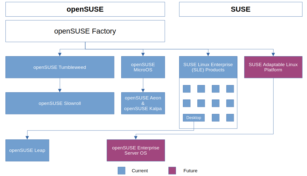
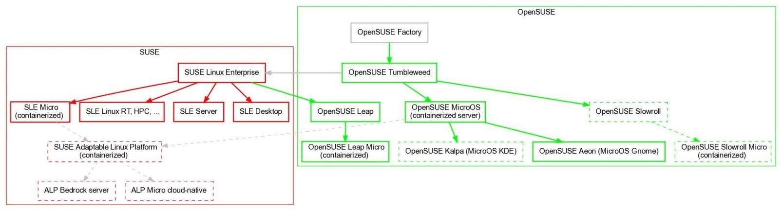
I’ve been trying to note down the rough upstream/downstream relationships for OpenSUSE/SUSE. I’d be interested in a more authoritative diagram similar to the following (just copied from my notes):

Colored lines represent solid descent, grey lines represent a looser contributory heritage. Dashed boxes represent something that is only emerging (like Slowroll). The layout is mostly automatic determined by dot, so don’t read too much into the vertical or horizontal placement of the nodes).

In case it helps, the graphviz source for the above is included below, the source can be formatted using the dot command line utility:

% dot -T jpeg < suse.dot > suse.jpg
digraph G {
    fontname="Helvetica,Arial,sans-serif"
    node [fontname="Helvetica,Arial,sans-serif", style=bold]
    edge [fontname="Helvetica,Arial,sans-serif", style=bold]


    subgraph cluster_0 {
        color="red";
        label=" SUSE ";

        SLE [shape=box, color=red, label=" SUSE Linux Enterprise ", ordering="out"];
        SLES [shape=box, color=red, label=" SLE Server "];
        SLED [shape=box, color=red, label=" SLE Desktop "];
        SLEMIC [shape=box, color=red, label=" SLE Micro "];
        SLEV [shape=box, color=red, label=" SLE Linux RT, HPC, ..."];
        SLE -> {SLES, SLED, SLEMIC, SLEV} [color=red];

        ALP [shape=box, color=red, style="dashed", label=" SUSE Adaptable Linux Platform "];
        SLE -> ALP [color=grey];
    }

    subgraph cluster_1 {
        color="green";
        label=" OpenSUSE ";

        LEAP [shape=box, color=green, label=" OpenSUSE Leap "]
        SLE -> LEAP [color=green]

        FACTORY [shape=box, color=grey, label=" OpenSUSE Factory "];
        TUMBLEWEED [shape=box, color=green, label=" OpenSUSE Tumbleweed "];
        SLOWROLL [shape=box, color=green, style="dashed", label=" OpenSUSE Slowroll "];
        FACTORY -> TUMBLEWEED [color=green];
        TUMBLEWEED -> SLOWROLL [color=green];

        TUMBLEWEED -> SLE [color=grey];


        MICRO [shape=box, color=green, label=" OpenSUSE MicroOS " ];
        AEON [shape=box, color=green, label=" OpenSUSE Aeon (MicroOS Gnome) " ];
        KALPA [shape=box, color=green, style="dashed", label=" OpenSUSE Kalpa (MicroOS KDE) "];
        MICRO -> {AEON, KALPA} [color=green];

        TUMBLEWEED -> MICRO [color=green];
        MICRO -> ALP [color=grey];
    }
}

2 Likes

This is awesome and something like this would be super helpful for the broader community, and I don’t think it really exists yet in a super authoritative form…

My amateur input on suggested tweaks would be:

  • SUSE ALP will be a replacement for the current “SLE and its innumerable versions” model, so I would have it as a descendant of Factory, rather than of SLE
  • If you can edit the layout, I would have openSUSE Leap located further away from Factory than any other openSUSE product, just to visually drive home the fact that it is an amalgamation openSUSE + SUSE product, not a “pure” Factory-based one

Perhaps others can confirm or correct my thoughts there?

1 Like

Yes, I looked around and was having trouble finding anything complete - but that doesn’t mean it doesn’t exist somewhere.

I had not understood that SLE was to be eventually supplanted by ALP - quite ambitious. I also wasn’t aware that ALP was more based on current factory than anything in SLE. When reading up on ALP/SLE and OpenSUSE ALP/MicroOS, the changes/evolution in concepts and naming often makes it difficult to figure out the current situation. I do hope this thread might help clarify more of the current state and history.

I may be wrong, I don’t often use graphviz, but I don’t think the layout is infinitely tweakable. There is some control of the ordering of edges leaving/entering nodes (but even that doesn’t seem to 100% work the way I would expect). It’s possible that, once the relationships are correctly established, a prettier tool could be used, and more notes/details added.

I had intended to use a different shape for the containerised products, so that’s something that’s also something that could be added.

I’m leaving a ton out and might be getting something wrong because I’m just a user/outside observer but how I would envision the layout is something like this, if it’s helpful:

1 Like

Thanks. This looks much clearer and cleaner than what I had managed to piece together. It would be nice to see the SLE subcomponents listed as they’re quite a mix, including a SLE Micro I think.

A diagram such as this, coupled with a brief description of each offering, would help remove much confusion.

1 Like

I received some more info after participating in a recent discussion over at www.phoronix.com/forums

The rough picture I now have is:

I’ve also uploaded the dot file as a github gist.

It should be noted that SUSE Liberty isn’t on the chart.

4 Likes